


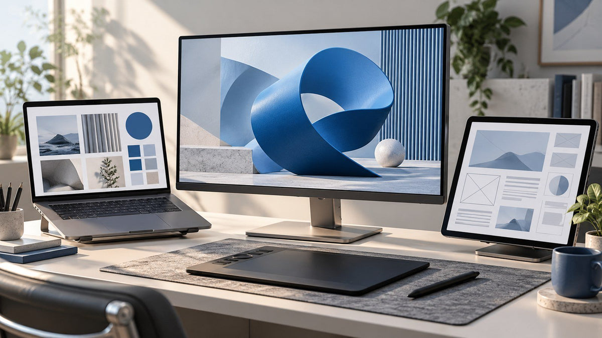
A professional designer workspace setup is not simply about creating the largest possible canvas. Designers rarely work inside one application from start to finish. A typical project can involve Figma, Photoshop, Illustrator, browser research, asset libraries, brand guidelines, prototypes, client feedback, and communication tools.
The real workspace challenge is deciding which information deserves to stay visible while you create.
Quick answer: A designer should organize screens by workflow role rather than treating every display equally. Keep the main creative application in the primary workspace, place frequently used assets and references nearby, and use supporting space for previews, feedback, or communication when needed. The arrangement should change with the design task.
A useful starting framework is:
Creation → Reference and assets → Preview and validation
These are workflow roles, not a requirement to use three monitors. One screen may handle multiple roles, and those roles can change as a project moves from concept to production to review.
The objective is not to surround yourself with displays. It is to give the information that supports your creative decisions a predictable place to live.

Why Design Workflows Need More Than Canvas Space
Design software can consume a lot of visual space.
Toolbars, layers, properties, component libraries, artboards, panels, and the work itself all compete for attention. Increasing canvas space can certainly help, but that solves only part of the problem.
Professional design also depends on supporting information such as:
- source images and creative assets
- moodboards and visual references
- brand guidelines
- typography references
- written requirements
- browser research
- prototypes and previews
- client comments
- project documentation
- team communication
This creates a useful distinction between canvas space and information space.
Canvas space is where the active creative work happens. Information space holds the material that helps the designer understand, compare, validate, or revise that work.
For example, a brand designer might have plenty of room for an Illustrator document but still need to repeatedly open a brand guideline PDF over the artwork. A UI designer may have a large Figma canvas but constantly switch away from it to check product requirements or preview the interface in a browser.
A supporting display earns its place when it keeps essential references, assets, or validation views from repeatedly covering the active design canvas.
That does not mean every designer needs several displays. If you are still deciding how much visible workspace your work actually requires, INVZI's guide can help you decide how many screens your workflow needs.
Once that question is answered, the more important design-specific question becomes:
What job should each available work area perform?
UI/UX Workflow: Design, Reference, and Prototype
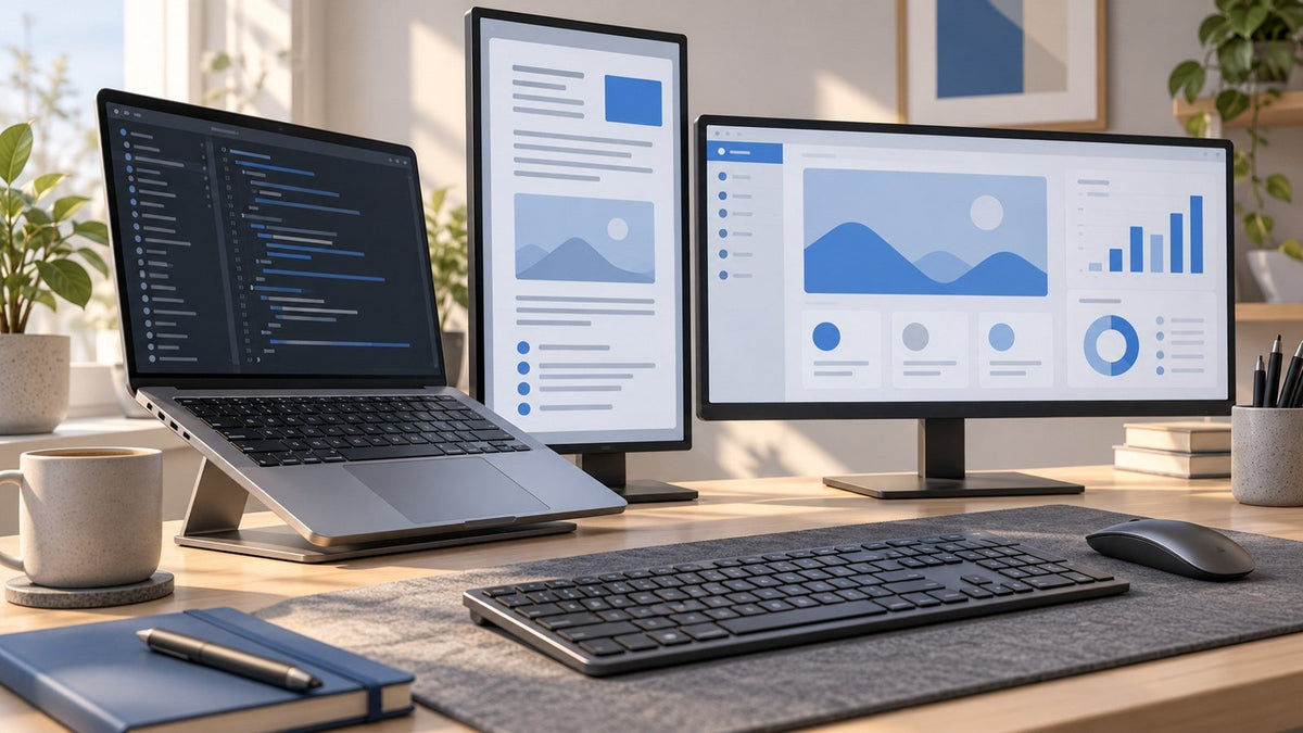
A UI UX designer setup often needs to support creation and validation at the same time.
Imagine designing a new checkout flow. The project may involve the current Figma file, an established design system, written requirements, examples of existing behavior, browser research, an interactive prototype, developer comments, and team feedback.
A practical workflow might assign those responsibilities like this:
Screen 1: Primary design
The primary work area contains the task receiving most of the designer's focused attention:
- Figma
- wireframes
- UI components
- active screens and flows
- design system editing
This area should normally occupy the most natural viewing position because it is where the designer is making the majority of active visual decisions.
Screen 2: Reference and context
The second work area keeps frequently consulted information accessible:
- browser research
- product requirements
- existing product behavior
- component documentation
- design guidelines
- user-flow references
Instead of covering Figma whenever a requirement needs to be checked, the designer can compare the requirement and the interface directly.
Screen 3: Validation or communication
When another visible area is useful, it can handle:
- interactive prototypes
- browser previews
- developer handoff
- project feedback
- Slack or Teams
The value of this arrangement is not simultaneous multitasking for its own sake.
It supports a simple loop:
Create → Check → Validate
Those roles should remain flexible.
During focused interface design, Slack may not deserve permanent space at all. During usability review or developer handoff, a prototype or browser window may become more important than the reference material.
A good design workflow setup changes with the work instead of permanently assigning one application to each screen.
Graphic Design Workflow: Let Screen Roles Change With the Project
A graphic designer desk setup often involves repeated visual comparison, but the information that matters most can change significantly during a project.
That makes graphic design a good example of why screen roles should be dynamic rather than fixed.
Concept phase: references become more important
Early in a branding, campaign, or packaging project, designers may spend significant time comparing:
- moodboards
- source photography
- typography directions
- visual references
- existing brand assets
- client briefs
The active design application remains important, but reference material may deserve almost equal visibility because the designer is still defining the visual direction.
A supporting work area can keep those materials accessible without repeatedly stacking them over Photoshop, Illustrator, or InDesign.
Production phase: the canvas takes priority
Once a direction is established, attention shifts toward execution.
The primary work area may now be dominated by the active artwork, while supporting space is used for:
- image assets
- logos and icons
- fonts
- copy
- brand guidelines
- source files
- related campaign elements
Consider a designer adapting a campaign key visual into multiple formats. The main canvas deserves most of the attention, but having the original artwork, asset folders, and brand rules nearby makes consistency easier to check without interrupting the production space.
Review phase: comparison becomes important again
During revisions, the workflow changes once more.
Now the designer may need easy access to:
- client comments
- proofs
- previous versions
- brand guidelines
- presentation views
- project management notes
A screen that previously held an asset library might temporarily become a review area.
This is the important principle:
The most useful screen assignment follows the stage of the design process.
A graphic designer does not necessarily need a permanent “assets monitor” or “reference monitor.” What deserves persistent visibility during ideation may be different from what deserves it during production or approval.
Video and Content Workflow: The Same Principle, Different Roles
Light video and content work demonstrates how the same workspace logic can adapt to another creative discipline.
A video-oriented workflow may prioritize:
Active editing → Media and project information → Playback or review
The timeline and editing controls may occupy the primary work area, while scripts, source media, or project notes remain nearby. During review, playback and feedback can become more important.
The purpose is not to prescribe a multi-monitor video editing setup. It is to show that screen roles should reflect the structure of the work.
For a designer, the supporting area may hold brand references. For a content editor, the same space might hold source media or a script.
Example Designer Workspace Roles
The same framework can therefore produce very different workspaces.
| Designer Type | Primary Workspace | Supporting Workspace | Additional Role When Useful |
|---|---|---|---|
| UI/UX Designer | Figma, wireframes, active UI | Research, requirements, design system references | Prototype, browser preview, feedback |
| Graphic Designer | Photoshop, Illustrator, InDesign | Assets, brand guidelines, visual references | Proofs, comments, project information |
| Brand Designer | Active identity or campaign work | Brand system, source material, typography | Presentation or client review |
| Light Video/Content Creator | Timeline and active editing | Media, scripts, project information | Playback or feedback |
| Hybrid/Freelance Designer | Current creative application | Project references and client material | Communication or preview |
The table is not a recommendation for a fixed number of monitors.
It shows how to distribute roles when additional visible workspace is available.
A UI/UX designer may combine research and prototype review on one supporting display. A graphic designer may switch a supporting screen from moodboard to client feedback as the project progresses. A freelancer may collapse several supporting roles into one workspace when working away from the studio.
The useful question is not “Which application belongs on monitor three?”
It is:
Which information benefits from staying visible at this point in the project?
Color-Critical Screen vs Supporting Screens
One of the most important distinctions in a professional creative workstation is that not every screen has to perform the same visual job.
Some work is color-critical.
Other work primarily supports the creative process.
Those responsibilities should not automatically be treated as identical.
The trusted display handles important visual judgments
Depending on the discipline and output, a designer may use a particular display for tasks where displayed color directly affects important creative decisions.
That could include:
- final image adjustments
- color-sensitive artwork
- photography decisions
- proofing within an appropriate managed workflow
- other final visual evaluations
The designer should know which display is trusted for these decisions rather than casually judging final color across several unrelated screens.
The International Color Consortium explains that display calibration and profiling are used together to achieve more consistent color. Calibration brings the display toward a desired behavior, while a display profile communicates its color characteristics within a color-managed workflow. Read the ICC guidance on display calibration and profiling.
Supporting screens solve a different problem
Other displays in the same workspace may spend most of their time showing:
- asset folders
- browser references
- documentation
- communication
- project management tools
- notes
- properties and panels
- prototypes
- non-final previews
That does not mean display quality is irrelevant on supporting screens. A visibly inconsistent screen can still make a workspace less comfortable or useful.
The distinction is about responsibility.
A screen displaying a Slack thread or asset folder does not necessarily need to carry the same responsibility as the display used for final color-sensitive decisions.
A practical rule is:
Use a known, trusted display for the visual decisions that require it. Let supporting displays keep supporting information accessible.
Connection method can matter as well. Native GPU-driven display output and software-based display technologies do not create identical display paths. INVZI's guide to native USB-C video vs DisplayLink explains the difference and why native video is generally preferable when low latency or visual accuracy is a priority.
The takeaway is not that every designer needs to think about display technology constantly. It is simply that the screen used for critical visual work deserves more deliberate consideration than one used primarily for documentation or communication.
Arrange Screens Around Attention, Not Symmetry
A designer's displays do not need equal visual importance, and they do not need equal physical importance either.
A symmetrical desk can look organized, but screen placement should ultimately reflect where attention goes.
A useful hierarchy is:
High attention → Center
Frequent reference → Adjacent
Lower-frequency information → Secondary position
If Figma, Illustrator, or Photoshop receives most of your focused attention, keeping that workspace in the most natural viewing position usually makes more sense than placing it to one side simply to create a symmetrical layout.
The U.S. Occupational Safety and Health Administration recommends positioning the primary monitor directly in front of the user when several monitors are used, with additional displays beside it. If use is divided relatively evenly, OSHA recommends keeping displays next to each other within a comfortable viewing angle while minimizing head movement. See OSHA's computer workstation evaluation guidance.
For a designer, this means physical placement should follow workflow priority.
If the center display contains the active design while a side display holds communication, the arrangement reflects the attention hierarchy.
If the application used for hours of concentrated creative work sits permanently off to the side while a low-priority dashboard occupies the center, the workspace may look balanced without actually supporting the work very well.
Portable Creative Workflow: Keep the Logic, Change the Hardware
Many creative professionals no longer work at one permanent desk.
A freelance designer might move between a home studio, client office, coworking space, and hotel within the same month. A hybrid designer may have a complete desktop environment at the office but rely primarily on a laptop elsewhere.
Trying to reproduce an identical physical workstation everywhere is rarely necessary.
Instead, preserve the logic of the workflow.
In the studio
A permanent workspace might have enough room to keep several roles visible:
Primary creation + References/assets + Preview/communication
At a client site
With a laptop and one supporting display, the workflow might become:
Primary creation + Combined reference/preview
Communication can stay hidden until it is needed.
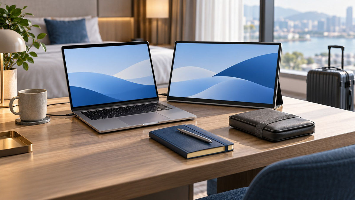
In a hotel or temporary workspace
When desk space is limited, the designer might reduce the visible structure further:
Primary creation + Most important supporting information
The important principle is:
Keeping the same workflow does not mean recreating the same hardware setup everywhere.
Instead, identify which relationships matter most.
If constant visual reference is essential to the project, preserve the reference space. If the work is in a client-review phase, feedback and preview may take priority. If the task is deep production work, the primary canvas may deserve nearly all of the available space.
Designers whose mobile work genuinely benefits from keeping references, assets, communication, or non-critical previews visible can explore INVZI's portable laptop screen extenders as one way to add supporting information space around a laptop. The collection includes portable multi-screen configurations intended for professionals who need more visible workspace away from a permanent desk.
The important distinction remains the same: additional portable screens do not automatically become the trusted reference for final color-sensitive decisions. Their value can simply be giving supporting information a dedicated place while the designer works away from the studio.
How to Build Your Own Design Workflow Setup
You do not need to start by buying equipment or deciding where every application should live.
Start with one representative project and observe how information moves through it.
Ask yourself seven questions.
1. What receives most of my active attention?
The application or task where you spend the majority of focused creative time is the strongest candidate for the primary workspace.
2. What do I repeatedly consult while creating?
References that you reopen constantly may deserve persistent visibility. Information used once or twice per day probably does not.
3. What do I repeatedly preview or validate?
UI prototypes, browser previews, proofs, presentations, or playback may benefit from a dedicated supporting role during particular project phases.
4. What can stay hidden until needed?
Not every application deserves permanent space. Email, messaging, and dashboards can become distractions if they remain visible without serving the current task.
5. Which decisions are genuinely color-sensitive?
Identify where final visual judgments happen. Do not assume every display needs to carry the same responsibility.
6. Which display is my trusted visual reference?
If color consistency matters to the work, make the reference role explicit rather than moving critical decisions casually between screens.
7. Which workflow roles need to travel with me?
If you work in several locations, identify what supporting information is important enough to preserve outside your main studio.
Once those answers are clear, assign space accordingly.
The simplest rule is:
Give persistent screen space only to information that benefits from persistent visibility.
That is what turns extra display area into an organized design workflow.
Build the Workspace Around the Creative Process
A strong designer workspace setup reflects how creative work actually moves.
The main canvas deserves focused attention, but professional design also depends on assets, references, previews, feedback, documentation, and communication. When all of that information continually competes for the same visual area, even a large display can feel disorganized.
A better approach is to assign clear roles.
For UI/UX designers, that may mean keeping creation, reference, and validation logically separated.
For graphic designers, screen priorities may change as a project moves from concept to production to review.
For designers working across several locations, the goal is not to reproduce the studio everywhere. It is to preserve the most important workflow relationships with the space available.
Multiple screens are therefore most useful when each one solves a specific information problem.
The goal is not more screens.
It is a creative workspace where the tools and information surrounding the design stop competing with the design itself.
Frequently Asked Questions
How should a designer organize multiple screens?
Organize screens by workflow role. Keep the main creative task in the primary workspace, place frequently used assets or references nearby, and use supporting space for previews, feedback, or communication when persistent visibility is useful. Allow those roles to change as the project changes.
How many monitors does a graphic designer need?
There is no universal number. A designer working mainly in one application may need less visible space than someone who repeatedly compares artwork with assets, references, proofs, and feedback. Choose the number of screens based on what needs to remain visible rather than the job title itself.
Does every monitor in a designer setup need to be color accurate?
Not every screen necessarily performs the same color-critical role. A designer should know which display is trusted for important visual judgments, while other screens may primarily handle assets, documentation, communication, tools, or supporting information.
Which screen should be the main display in a UI/UX designer setup?
The screen receiving the most focused attention should normally be treated as the primary display. During active interface design, that may be the Figma workspace. During testing or review, a prototype or browser preview may temporarily become more important.
Can a designer maintain the same workflow while traveling?
Yes. Maintaining the workflow does not require identical hardware. Preserve the most important roles and combine lower-priority information when space is limited. A studio's separate reference and preview areas, for example, might become one supporting display while traveling.
Are multiple monitors necessary for professional design work?
No. Additional screens are useful when specific information benefits from remaining visible while you create. If your work is focused and sequential, more displays may add little value. The workspace should solve an actual workflow problem rather than maximize screen count.

Leave a comment
This site is protected by hCaptcha and the hCaptcha Privacy Policy and Terms of Service apply.